
In the dynamic world of design, staying ahead of the curve is crucial, and Figma has consistently proven itself as a powerful tool for designers. With the arrival of 2023, Figma has unveiled a range of exciting new features that aim to enhance collaboration, streamline workflows, and push the boundaries of design possibilities. In this article, we will delve into the latest additions to Figma, ensuring a plagiarism-free exploration of these innovative features.
Figma has recently introduced a groundbreaking new feature called Dev Mode. This innovative addition bridges the gap between design and development, empowering designers and developers to collaborate seamlessly. In this article, we will delve into the details of Figma’s Dev Mode feature, highlighting its benefits and exploring how it can revolutionize the design-to-development workflow.
The introduction of Dev Mode in Figma simplifies the handoff process between designers and developers. Traditionally, this phase has been prone to miscommunication and inefficiencies. However, Dev Mode provides a solution by generating clean and organized code snippets that developers can directly extract from the design file. This streamlined handoff process saves time, reduces errors, and ensures that the final product accurately reflects the design vision.
Dev Mode takes design documentation to a new level of interactivity. With this feature, designers can annotate their designs with interactive elements such as hover states, transitions, and animations. These interactive specifications offer developers a clear understanding of the design’s behavior and desired user interactions. By providing such detailed documentation, Dev Mode fosters a smoother collaboration process, resulting in a more accurate implementation of the design vision
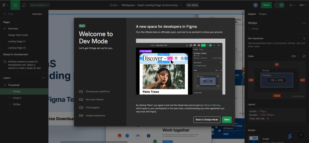
Figma Dev Mode Enabled
As you can see in the image (right for desktop) and (down in mobile), you can easily switch to dev mode at just one click of a tooggle button placed at the top right side of the screen.

How can a Dev tool work better for developers?
Maintaining design consistency across a project can be challenging, especially when it comes to design elements such as colors, typography, and spacing. Dev Mode introduces dynamic design tokens, which enable designers to define and manage these elements in a central location. Developers can then access and implement these design tokens in their code, ensuring consistency and eliminating the need for manual adjustments. This feature promotes design system scalability and streamlines the design-to-development workflow. Design concepts like pixels, layers, and groups are brought closer to developer ideas like code, icons, and tokens in Dev Mode, which is similar to a browser inspector for your design file.
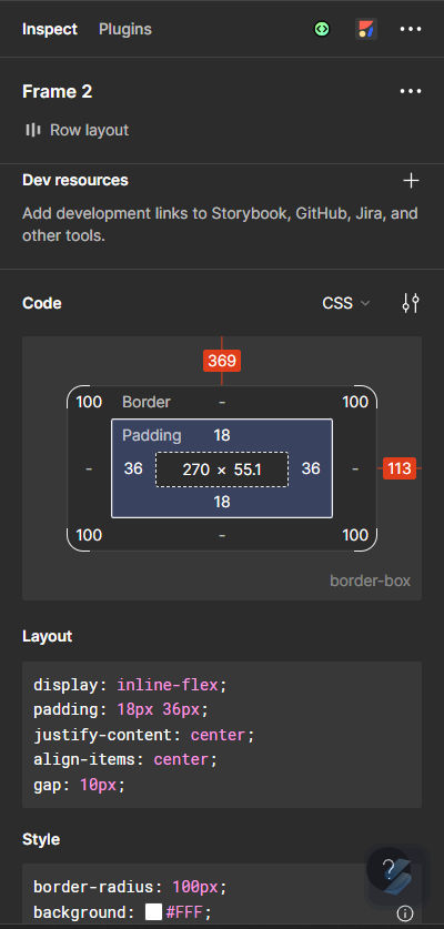
Inspect Design
The inspect panel displays design specs and relevant component information needed to understand a design and transform it into code.
Compare Design Changes
If a file has changed since you last saw it, Compare changes will show up in the examine panel next to the layer information. To view the frame history modal and compare the current version of the design to earlier iterations, click the link. To prevent seeing information about the original component, you can clear the detachment history of a detached component and compare it to the main component.
Adding External Links for Developers
Links to external resources that may aid in the creation of a component may be included by both designers and developers. Links to GitHub, Jira, Storybook, and VS Code that may be utilised with the Figma for VS Code extension are all examples of this. Component instances are all affected when developer resources are added to a component.
Build faster with customizable code snippets
While in development mode, click any item on the canvas to fill the inspect panel’s Code section. A typographic preview or box model is shown, followed by automatically generated code snippets for the selected object, depending on what was chosen. You can modify the functionality of code snippets and choose the language and units to be displayed in the canvas and generated code.
Try component variations in the component playground
You will see a component preview, a link to the main component, and any links to pertinent documentation and developer resources when you choose a component or instance. When a component instance is chosen, the component playground is displayed in the inspect panel. Without altering the original design, play around with the component’s various characteristics in the playground.
Also Read :: Why Should Businesses Use Flutter To Build Mobile Apps
Real-Time Design Updates
In the past, design changes during the development phase often led to confusion and delays. Dev Mode addresses this issue by providing real-time design updates to developers. Any modifications made to the design in Figma are instantly reflected in Dev Mode, allowing developers to stay up-to-date with the latest design iterations. This real-time synchronization ensures that both designers and developers are always aligned, reducing rework and enhancing collaboration.
Final Words…
Figma’s Dev Mode feature represents a significant leap forward in bridging the gap between design and development. With simplified handoff processes, interactive design documentation, dynamic design tokens, real-time updates, and seamless integrations, Dev Mode empowers designers and developers to collaborate effectively, resulting in a more streamlined and efficient design-to-development workflow. By embracing this innovative feature, design teams can unlock their full potential, bringing designs to life with precision and creativity. Figma’s Dev Mode is a game-changer, revolutionizing the way design and development teams collaborate and deliver outstanding digital experiences.


One Comment
Comments are closed.